 |
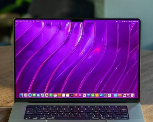
| Apple likes the MacBook Pro's screen bump |
Apple has introduced a major update in the latest version of the MacBook. This is because it finally restores the various ports on the device, improving the experience, especially for photographers and professionals, as well as anyone who needs to connect add-ons and other devices to a PC.
In addition, with some obvious differences, the device offered a better screen and eliminated the touch bar because it came with M1 Pro and M1 Max processors and provided performance that mimics the main processors and graphics cards.
But on top of all these improvements, the company has also added something that most users don't like. It's a bump on the screen. This is because MacBook Pro laptops now have a notch similar to iPhones.
This new MacBook Pro screen swipe has raised a lot of objections because it takes up some screen space on the one hand and doesn't do any good on the other.
Apple's comments irked users, especially Shruti Haldia, Apple's Mac product line manager. This is explained in the Same Brian audio program, which shows that even when compressed, users can get the most out of the screen.
Apple likes the MacBook Pro's screen bump
Haldia also said that Apple has made the screen bigger and smaller in exchange for the top notch. He also recommends this "very smart" behavior as it gives users more screen space.
There is no doubt that Haldia is right to increase the screen size and reduce the bezel. But it may be different with the "intelligence" of Apple's parties in the MacBook Pro.
Here the compression does not provide any additional advantages, as does the facial recognition Face ID, despite the huge space for the system components on the one hand and the high price of the MacBook Pro. On the other hand.
On the other hand, not all users agree with the ugly shape of the bumps. This is because there is no reason to forgive as there is with the iPhone. Including collision when turning on the face recognition system to recognize faces.
As usual, Apple thinks the new design is perfect. Although users may not agree with this point, they will likely get used to this design over time.
