 |
| Google redesign its mobile search engine |
Google announced in its blog on Friday that it is rethinking the look and feel of mobile search results with an emphasis on simplicity.
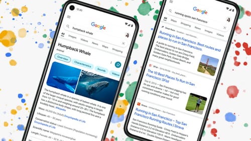
Google describes the updated user interface as a visual overhaul that aims to make things easier for users, centralize information, and make text easier to read.
We want to take a step back to keep things simple and make it easier for people to find what they want, faster and easier, ”said Aileen Cheng, responsible for the remodeling in the post.
She explained that maintaining consistency about when and how fonts are used in searches is also important, which also helps people analyze the information more effectively.
The redesigned content has bigger, bolder text for quick analysis, and there are more Google fonts for Android and Gmail in the results.
Search results also take up more space on the screen and stretch from one edge to the other, partly due to reduced shadows. This makes it easier to find the results you want and saves you money. Visual space.
Google also uses color to highlight important content, and companies can use color to direct users to information by displaying results against a clean background.
Google also said: The redesign uses color more specifically to highlight important information without being distracting.
The new design appears to place more information at the top of the page and reduce visual clutter. We hope this makes analyzing the results easier without having to scroll much to find what you need.
Cheng said Google will make a redesign in the next few days: Rethinking visual design like search is really complicated.
She added: Especially with the development of Google search, we do not only organize information on the Internet but all information in the world. We have started organizing web pages, but now we are helping to understand the content and nature of information. There are many differences.
