 |
| Microsoft introduces the new Windows 10 Start menu |
A short video from Microsoft, published on Twitter via a Microsoft Design account, for Windows 10 provides a clear snapshot of the new start menu. This video shows the Start menu (which is an integral part of the operating system). Since Windows 95) how it develops. Over the years.
As we all know, the software giant is trying to rethink its "Start" menu for Windows 10. According to the tweet, the Microsoft design team asked Twitter users about their ideas about the new concept. It is positive.
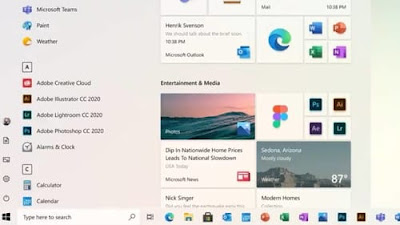
The new Start menu looks more attractive than the current version. Icons in the new Start menu now use the new Microsoft Fluent design principles and generally offer more storage space. So if you install a lot of apps, this will not cause any confusion.
Despite rumors that Microsoft is planning to remove it, Live Tiles (an interactive icon highlighting information from the app you represent) is still in the new Start menu.
Some people seem to be confusing by removing the text below the app icon. Although this change can make the appearance more visible, it depends on the user's knowledge of the application code, and the change may be the most controversial, as it can be especially confusing after that. Microsoft has changed many icons.
According to reports, users have not received a specific date for the new start menu. The new listing may change its appearance when it officially arrives, but is expected to be introduced via an update (Windows 10 20H2) at the end of the year, rather than expected soon (Windows 10 May 2020).
